
Pressed wildflowers have an imperfect, delicate charm that translates naturally into crochet inspiration. Tiny blossoms, slender stems, faded garden colors, and irregular botanical arrangements can give a phone case a softer, more personal look without making the design feel overly busy. This collection explores 15 directions, ranging from scattered meadow flowers and cottage roses to minimal single stems and darker night-garden palettes. Use these ideas as visual references for comparing motif placement, color combinations, edging, texture, and overall mood while planning a phone case style that feels right for you.
ABOUT THESE IDEAS
These concepts are intended for visual inspiration, color exploration, style comparison, and creative planning. Borrow a palette, motif arrangement, border idea, or overall mood rather than treating any single look as a fixed design.
QUICK IDEA FINDER
| If You Like… | Look For |
|---|---|
| Soft cottage charm | Lavender Sprig, Cottage Rose |
| Tiny delicate flowers | Forget-Me-Not, Queen Anne’s Lace |
| Bright spring color | Golden Buttercup, Pastel Wildflower Collage |
| Modern simplicity | Botanical Panel, Minimal Single Stem |
| Rich seasonal color | Autumn Wildflower, Moonlit Wildflower |
| A classic botanical feel | Daisy Herbarium, Wildflower Border |
| Looser meadow styling | Meadow Scatter, Tiny Fern and Flower |
BEFORE YOU CHOOSE
Think about how much of the case you want the flowers to visually occupy. Small scattered motifs keep the look light, while clustered florals create more of a statement. Also consider the base color: ivory and oatmeal make faded flower shades feel soft and nostalgic, while charcoal or deep neutrals turn pale blossoms into stronger focal points. Borders, centered panels, and single stems are useful directions when you prefer more visual order.
Crochet Meadow Scatter Phone Case
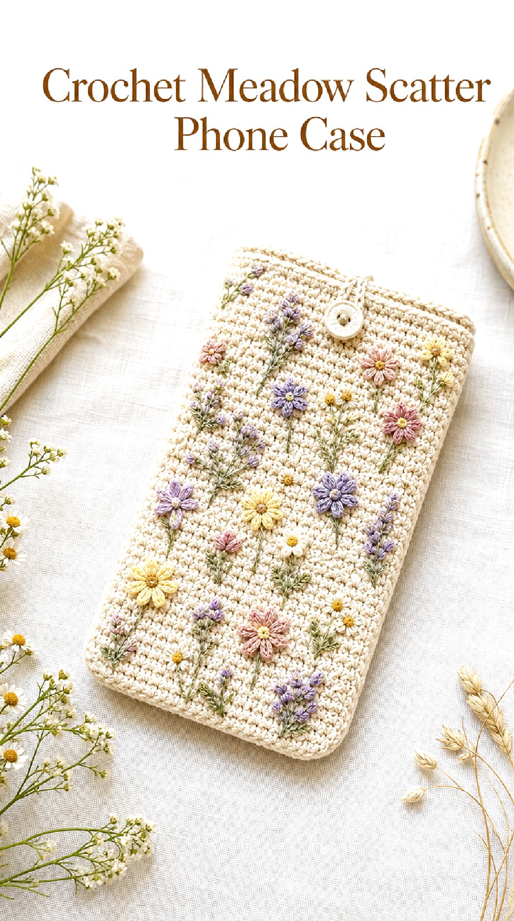
The Crochet Meadow Scatter Phone Case takes its cue from the loose, unplanned arrangement of flowers gathered from a field and pressed into a notebook. Tiny blossoms spaced across a calm neutral base give the case movement without making it look crowded. The slightly irregular motif placement is what gives this concept its relaxed botanical character.
Why the Scattered Look Works
A meadow rarely looks perfectly symmetrical, and that unevenness is part of the appeal here. Leaving visible space between blossoms keeps individual flower shapes readable while allowing the base stitches to remain part of the design.
Try imagining a mix of smaller buds and a few slightly stronger floral accents. Variation in visual scale can make the arrangement feel more natural than repeating one identical motif.
Color Mood
Soft butter yellow, lavender, dusty pink, cream, and muted green create a spring-meadow atmosphere. Keeping the shades somewhat softened helps the palette resemble preserved flowers rather than a very bright floral print.
For a calmer variation, reduce the palette to two flower colors plus green. For more energy, include several small accent shades while keeping the background neutral.
Placement Worth Borrowing
Instead of distributing flowers in an exact grid, picture them drifting diagonally from one lower corner toward the opposite upper side. This can guide the eye across the whole phone case.
A few tiny leaves or stem-like details between blossoms can visually connect the motifs without turning the surface into one continuous pattern.
Crochet Lavender Sprig Phone Case
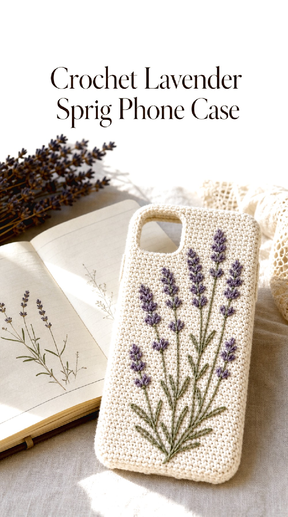
The Crochet Lavender Sprig Phone Case draws inspiration from dried lavender stems tucked into journals, letters, and botanical collections. Narrow purple floral accents paired with slim green details give the case a graceful vertical rhythm. It feels especially suited to readers who prefer botanical decoration that is noticeable but still restrained.
Shape Inspiration
Lavender has a naturally elongated silhouette, so this concept works well when the decorative direction follows the length of the case. Vertical motifs can make the overall phone pouch appear visually taller and more streamlined.
Rather than filling the entire surface, a small gathering of two or three sprig-like forms could create enough botanical interest.
A Muted Palette
Dusty lavender, faded violet, sage, and warm cream make a gentle combination. An oatmeal or light beige base can add a slightly aged, herbarium-inspired mood.
For a cooler interpretation, pair lavender with soft gray and eucalyptus green. A warmer version could introduce muted mauve or antique rose.
Styling Direction
This look pairs naturally with cottage, romantic, and quiet vintage aesthetics. A softly textured base and uncomplicated edging would allow the slender botanical details to remain the visual focus.
If you prefer a cleaner appearance, place the floral direction along only one side of the case rather than across its center.
Crochet Daisy Herbarium Phone Case
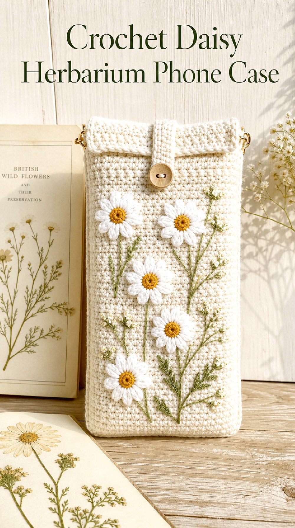
The Crochet Daisy Herbarium Phone Case combines cheerful daisy shapes with the orderly feeling of a botanical specimen page. White petals and warm golden centers stand out clearly against a natural-toned background, while restrained green details keep the arrangement grounded. The result feels fresh, familiar, and easy to adapt to both spring and summer styling.
Design Detail to Notice
Daisies have clear, recognizable shapes, so they can hold their own without many supporting details. A few well-spaced blooms may have more impact than covering every available area.
Keeping the stems or leaf accents visually slim helps the round flower heads remain the main attraction.
Herbarium Influence
A specimen-inspired layout feels slightly more organized than a scattered meadow design. Imagine several daisies facing different directions but arranged with intentional breathing room around each flower.
You can also take inspiration from old botanical pages by keeping the base color creamy rather than bright white.
Seasonal Twist
For spring, lean toward crisp ivory, fresh green, and sunny yellow. For late summer, soften the same colors into warm cream, olive, and muted mustard.
A black or charcoal base would create a completely different version, giving the white petals a more graphic, contemporary presence.
Crochet Forget Me Not Phone Case
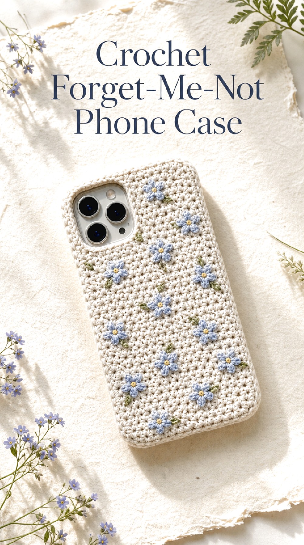
The Crochet Forget-Me-Not Phone Case focuses on tiny blue blossoms and the gentle visual rhythm created by repeating small motifs. Instead of one large floral centerpiece, the charm comes from miniature flowers distributed lightly over the case. Powder blue against oatmeal, cream, or warm ivory creates a quiet palette that feels delicate without becoming overly sweet.
Tiny Motifs, Strong Identity
Small flowers can create plenty of character when their color is distinctive. Forget-me-not blue naturally becomes the identifying element, so the surrounding palette can stay simple.
Leaving larger areas of the base visible also prevents tiny motifs from merging into one busy surface.
Color Direction
Powder blue and muted cornflower shades work especially well with cream and pale oatmeal. Tiny touches of soft green can keep the design botanical without competing with the blue flowers.
For a softer romantic version, add a trace of pale pink. For a cooler modern direction, combine the blue with stone gray.
Gift Inspiration
This concept has a gentle, understated quality that makes it easy to imagine as a personalized gift direction. The small-flower look can feel especially thoughtful when the recipient already enjoys blue, cottage styling, or botanical details.
A simple contrasting edge could provide just enough definition while preserving the delicate mood.
Crochet Poppy Pressing Phone Case
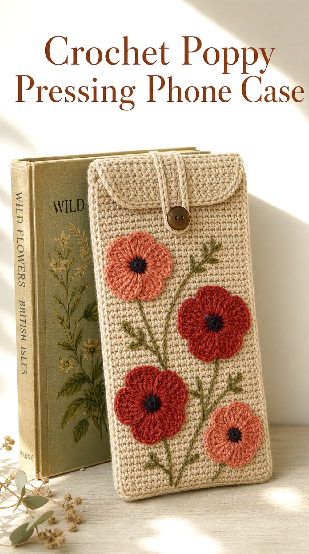
The Crochet Poppy Pressing Phone Case brings warmer, stronger color into the pressed-flower theme. Muted coral, brick red, and terracotta-toned blossoms create focal points against a beige or cream background, while darker centers give the flowers definition. It offers a more expressive botanical direction without losing the slightly faded character associated with preserved flowers.
What Makes It Stand Out
Poppies have broader flower shapes than many tiny meadow blooms, so a few motifs can carry considerable visual weight. This makes them a good choice when you want florals to be obvious from a distance.
Spacing them apart helps each blossom read as an individual botanical form rather than part of an allover print.
Warm Botanical Color
Try thinking beyond bright red. Coral, rust, clay, muted scarlet, and softened burgundy can give the concept more depth.
Olive-green stem details pair especially well with these warm shades. An oatmeal background keeps the overall combination earthy and wearable.
A Bolder Variation
A deep charcoal case with rusty red poppies would shift this idea toward a dramatic autumn look. Cream flowers could also be mixed into the arrangement to create stronger contrast.
For a quieter version, use only one poppy near a lower corner with a slender stem extending upward.
Crochet Queen Anne’s Lace Phone Case
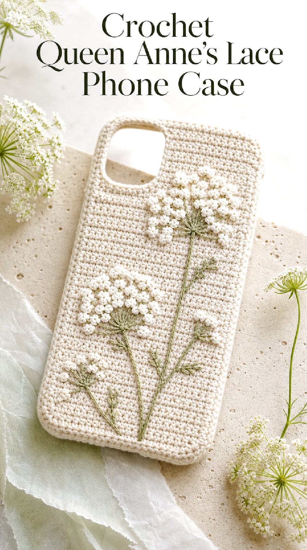
The Crochet Queen Anne’s Lace Phone Case is inspired by one of the airiest wildflower silhouettes. Small clustered white details, delicate green stems, and generous negative space create a light botanical effect. Rather than relying on strong color, this concept is all about fine texture and the contrast between detailed floral areas and a simple base.
Texture Direction
Because the palette is restrained, surface texture becomes particularly important. Slightly raised floral clusters against flatter background stitches can create enough visual separation even when the colors are very similar.
The delicate look works best when the surrounding details remain simple rather than competing for attention.
Visual Balance
Consider placing one taller floral cluster on one side and a shorter grouping lower on the opposite side. This kind of uneven balance can feel more natural than centering everything.
Leaving open areas around the flowers helps reinforce the impression of fragile stems preserved on paper.
A Cleaner Version
Cream flowers on a warm taupe or pale sage base can make the design feel contemporary rather than purely cottage-inspired. Keeping the edging close in color to the background would strengthen that minimalist direction.
For more contrast, reverse the palette with pale flowers over deep moss or charcoal.
Crochet Golden Buttercup Phone Case
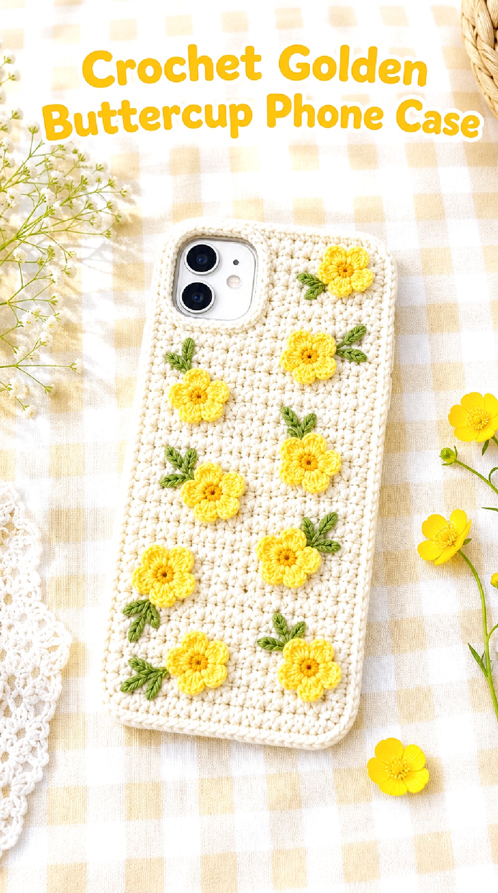
The Crochet Golden Buttercup Phone Case adds a cheerful note to the collection with tiny yellow blooms inspired by pressed buttercups. Against ivory or light beige, the sunny motifs feel bright without overpowering the phone case. Small green leaves and uncomplicated flower placement can keep the design playful, fresh, and especially suited to springtime styling.
Color Mood
Butter yellow is the natural focal point, but the surrounding colors determine whether the effect feels soft or bold. Cream and sage create a mellow cottage palette, while white and fresh green feel sharper and brighter.
A small amount of pale blue can introduce another spring note without distracting from the yellow flowers.
A Playful Direction
This concept can handle slightly less formal motif placement. Picture blooms appearing near the corners, along one side, and near the center rather than forming a strict repeated pattern.
Small differences in flower size can make the surface feel lively while still visually connected.
Where This Look Fits
The lighthearted palette works especially well with casual accessories, spring wardrobes, and cheerful desk or bag styling. It can also provide a softer alternative to more graphic floral patterns.
For a subtler seasonal interpretation, shift the yellow toward muted ochre and pair it with oatmeal.
Crochet Wildflower Border Phone Case
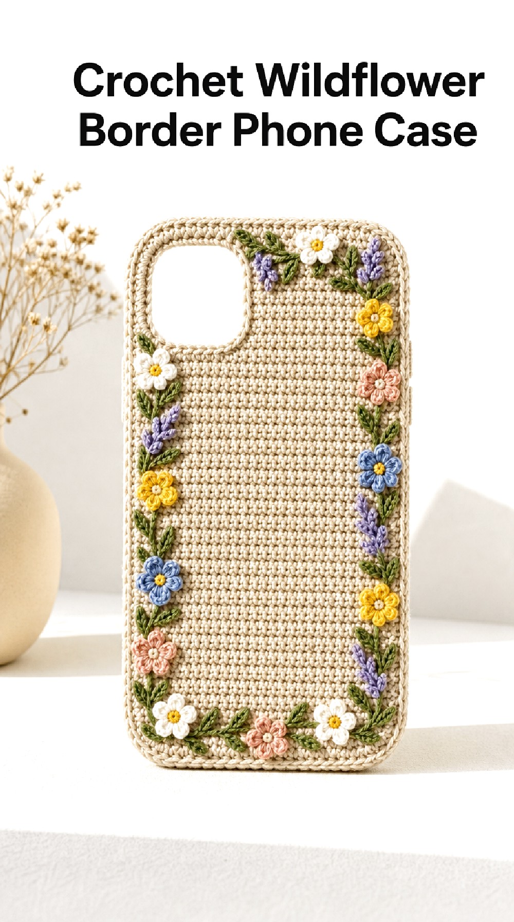
The Crochet Wildflower Border Phone Case keeps the center of the case relatively quiet and concentrates botanical detail around the edges. Tiny blossoms, leaves, and subtle stem shapes form a frame-like effect that feels decorative without hiding the underlying crochet texture. It is a useful direction when you enjoy floral detail but prefer a more organized layout.
The Border Changes Everything
Moving decoration to the outer edge creates an immediate sense of structure. The middle area can remain simple, which gives the eye a resting place and makes the border feel more intentional.
A narrow border feels delicate, while a wider collection of flowers can create a more ornate frame.
Color Blocking Direction
Consider keeping the case base and border foundation in closely related neutrals, then introducing color only through the blossoms. This allows small shades such as dusty rose, lavender, blue, and mustard to feel especially noticeable.
A tonal border using cream, beige, and sage would create a much softer interpretation.
Modern Update
For a cleaner version, limit the floral frame to two corners rather than surrounding the entire case. The resulting asymmetry can make traditional botanical details feel more contemporary.
A slim contrasting edge outside the flowers can also visually sharpen the silhouette.
Crochet Botanical Panel Phone Case
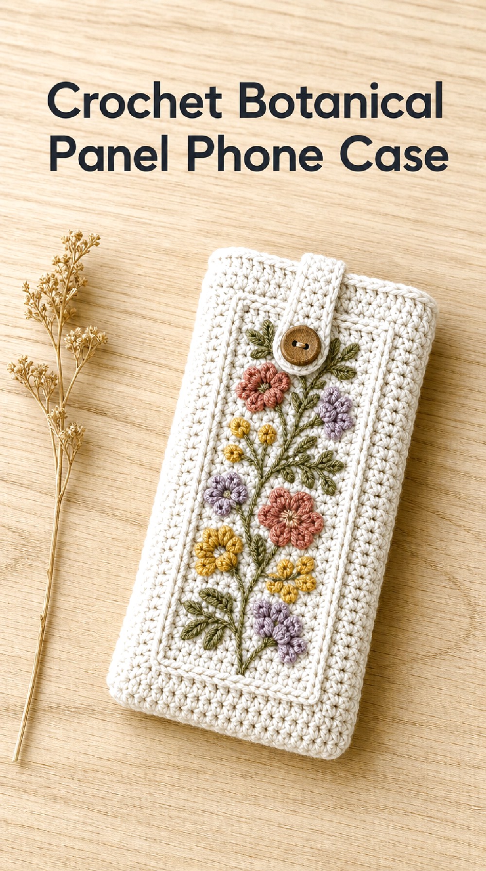
The Crochet Botanical Panel Phone Case uses a centered strip of floral detail rather than scattering flowers across the entire surface. A vertical botanical panel gives the case a neat, architectural quality while still allowing room for wildflower color. This direction bridges romantic floral inspiration and modern graphic organization particularly well.
Visual Focus
A centered panel immediately guides attention down the middle of the case. That makes it possible to combine several small flowers without making the entire surface feel busy.
The surrounding background can stay plain, emphasizing both stitch texture and the boundaries of the floral area.
Modern Color Direction
Warm ivory with muted rose, mustard, moss, and lilac feels current while retaining a botanical softness. A beige-and-black foundation could create an even more contemporary version.
If you prefer lower contrast, choose flowers from neighboring shades such as cream, tan, faded peach, and clay.
Detail Worth Borrowing
The panel does not have to be perfectly rectangular in appearance. Small leaves or flower tips extending slightly beyond its visual boundary can soften the geometry.
That subtle irregularity helps preserve the wildflower influence while maintaining the organized composition.
Crochet Cottage Rose Phone Case
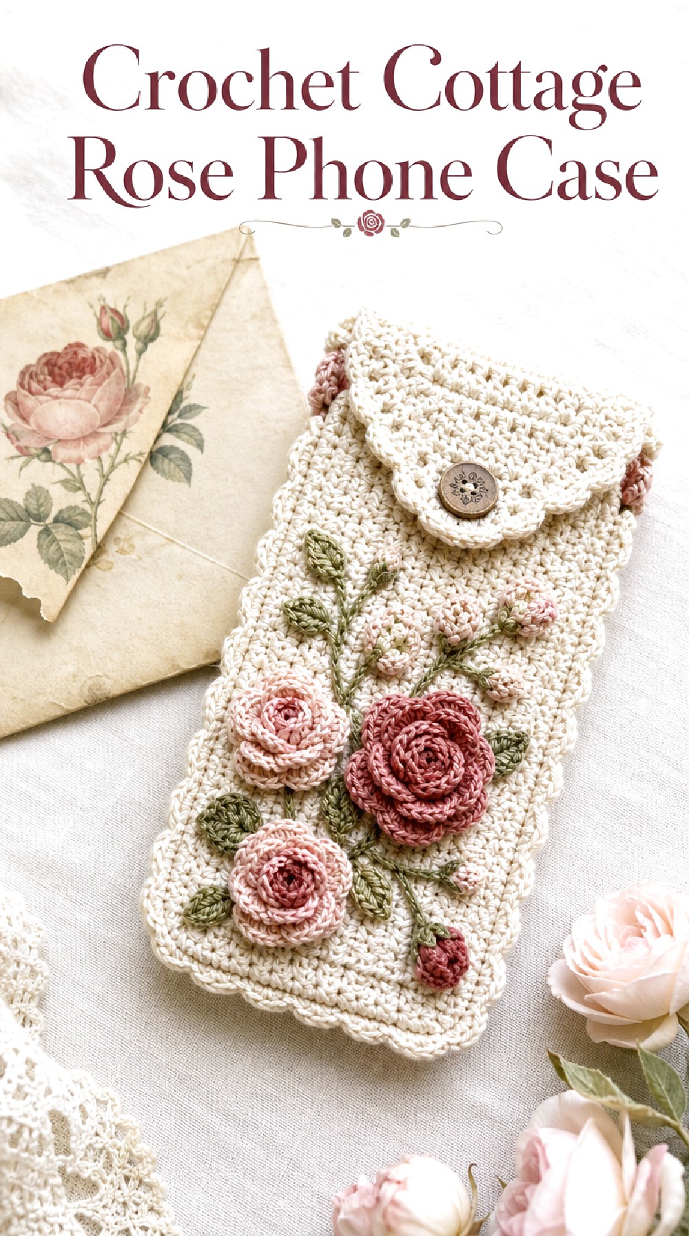
The Crochet Cottage Rose Phone Case turns toward old-garden romance with faded rose shades, cream backgrounds, and small leafy accents. Rather than bold, perfect rose forms, imagine softly defined floral motifs that capture the mood of blossoms saved between pages. The combination feels nostalgic and works especially well with warm neutrals and gently textured surfaces.
Vintage-Inspired Touch
Dusty rose, antique pink, faded mauve, moss, and cream naturally suggest vintage botanical textiles and old flower albums. Keeping the colors softened is what prevents the look from becoming overly sugary.
A warm beige base can deepen the nostalgic quality even further.
Shape Balance
A cluster near one corner can be more effective than evenly spacing roses across the whole case. Letting smaller leaves or buds trail away from the main cluster gives the composition direction.
Another option is a loose vertical arrangement, with larger flowers lower down and smaller details toward the top.
A Softer Variation
For a very subtle interpretation, use cream flowers over oatmeal and reserve pink for only the centers or smallest accents. This creates a nearly tonal case with just a hint of garden color.
A scalloped-looking visual edge could complement the romantic character without requiring extra decorative motifs across the surface.
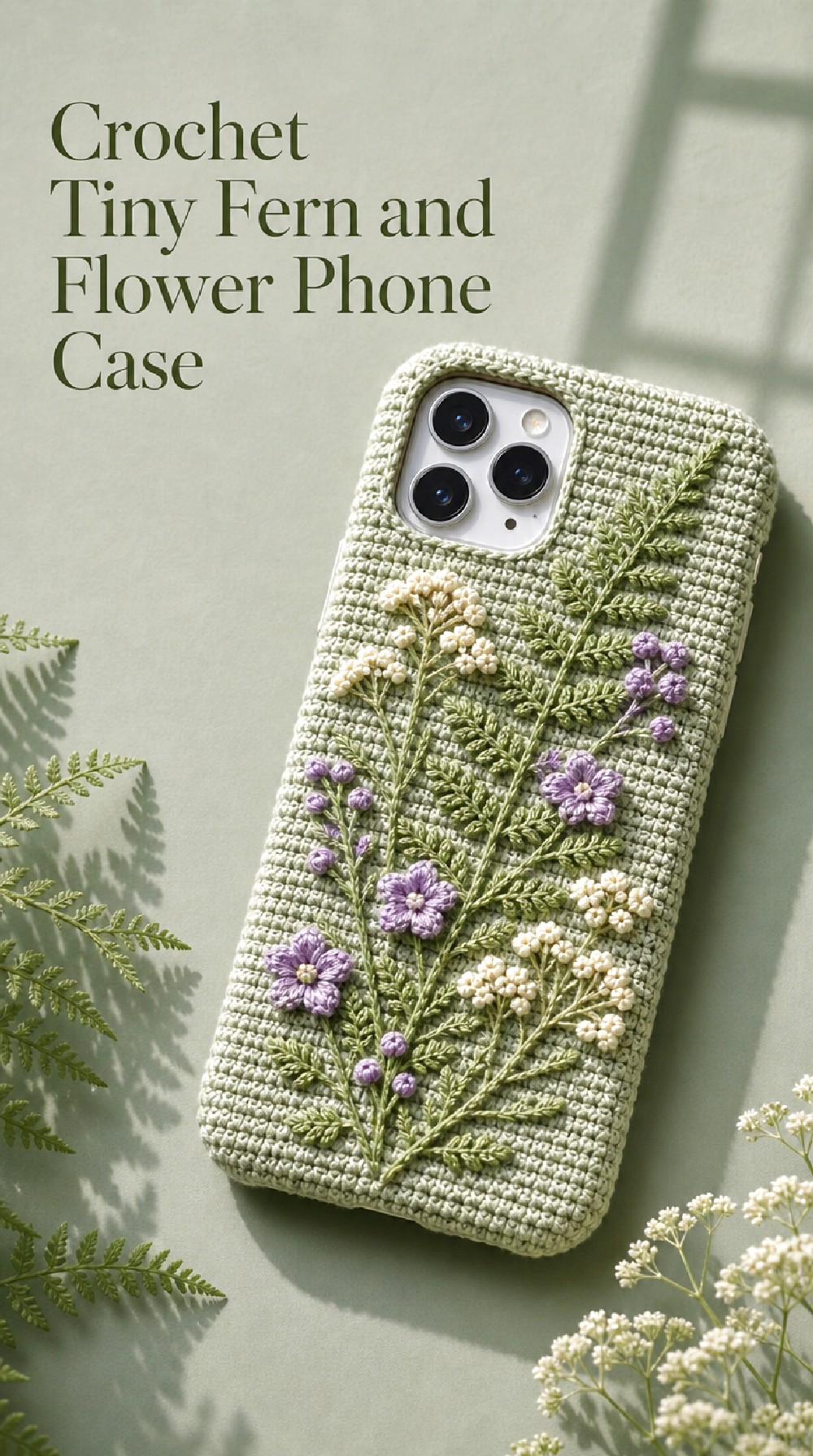
Crochet Tiny Fern and Flower Phone Case
The Crochet Tiny Fern and Flower Phone Case mixes miniature blossoms with narrow leafy forms inspired by pressed ferns. The contrast between linear greenery and rounded floral motifs makes the surface feel collected and layered, almost like a small botanical scrapbook. Sage, cream, lavender, and dusty blue keep the concept natural and slightly woodland-inspired.
Why Mixed Botanicals Work
Combining flowers with leafy forms creates more shape variety than using blossoms alone. Fern-like details can fill narrow spaces while still keeping the overall arrangement light.
The greenery also gives the eye a path to follow between separate flowers, which can make an asymmetric composition feel connected.
Woodland Color Mood
Moss, sage, dusty blue, soft cream, and faded lavender create a quiet woodland palette. If you want a warmer result, introduce muted rust or golden tan.
A deep forest-green base with pale florals would make the same concept considerably richer and moodier.
Placement Idea
Try imagining the botanical grouping beginning densely near one lower corner and gradually becoming more sparse toward the top. This creates the feeling of plants growing upward without turning the design into a literal garden scene.
Keeping the opposite side mostly open can strengthen the asymmetry.
Crochet Autumn Wildflower Phone Case
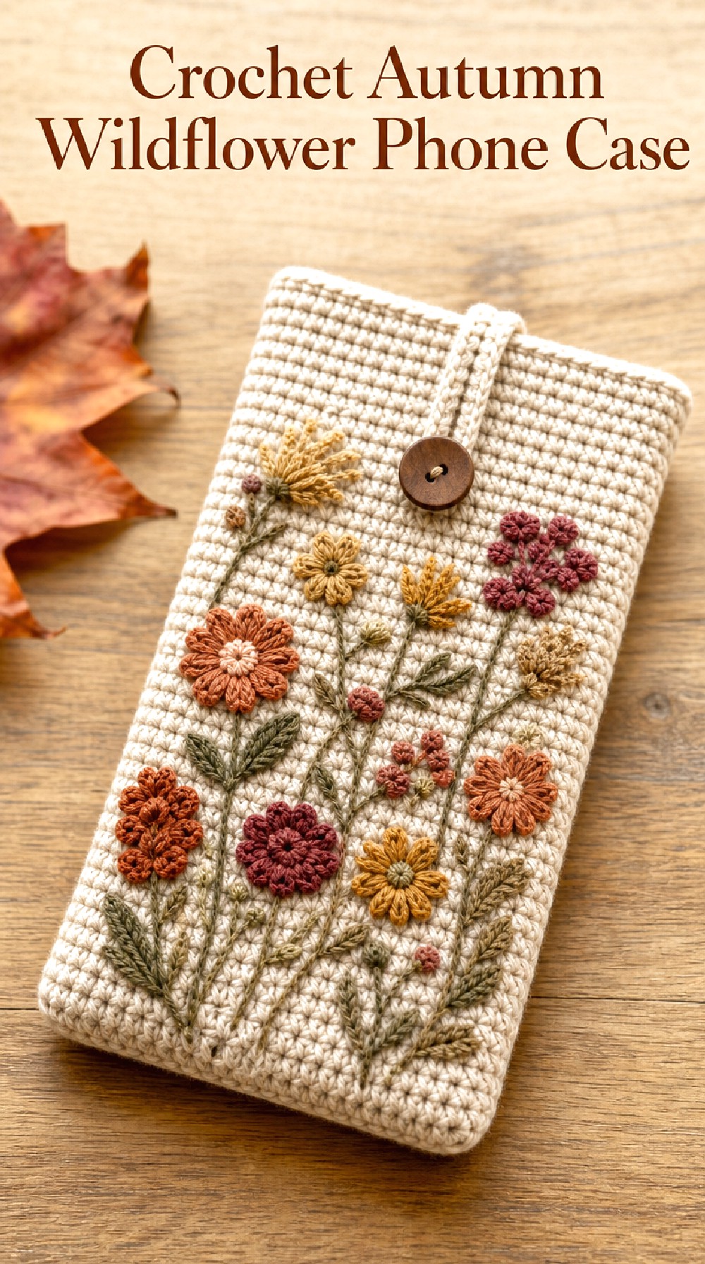
The Crochet Autumn Wildflower Phone Case reimagines pressed florals in late-season shades rather than traditional spring pastels. Rust, muted ochre, clay, faded burgundy, warm brown, and olive create a grounded palette that complements an oatmeal base. Small botanical motifs keep the seasonal color approachable enough for an everyday accessory.
Seasonal Twist
Wildflower inspiration does not have to feel exclusively springlike. Changing the palette can completely shift the mood while retaining the same delicate floral vocabulary.
Warm muted shades suggest seed heads, dried petals, and late-summer stems without needing obvious autumn symbols.
Texture Direction
A slightly more substantial-looking base texture pairs nicely with these earthy colors. Raised flower centers, subtle edging, or small bobble-like accents can create additional visual depth.
Keeping decorative texture concentrated around the floral areas prevents the case from appearing overly heavy.
Everyday Version
For a quieter look, use oatmeal, rust, and olive only. This three-color direction feels easy to pair with denim, tan leather accessories, and neutral fall wardrobes.
For more drama, introduce deep plum or charcoal as a small accent.
Crochet Moonlit Wildflower Phone Case
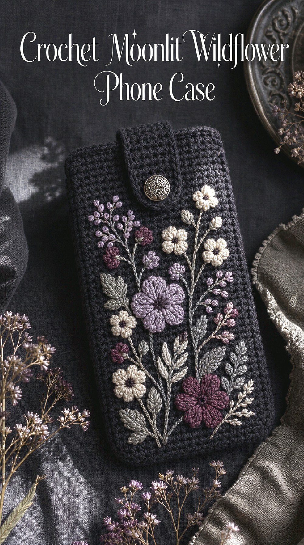
The Crochet Moonlit Wildflower Phone Case takes the pressed-botanical theme into a darker palette. A charcoal or deep slate background gives pale cream, dusty lilac, muted plum, and gray-green florals a night-garden character. The concept feels more dramatic than traditional cottage florals while still keeping the motifs delicate and nature-focused.
Contrast Creates the Mood
Light flowers against a dark base immediately become more graphic. Because the contrast is stronger, you can use fewer botanical details and still achieve a noticeable effect.
This makes the direction particularly suitable for someone who likes florals but prefers darker accessories.
Gothic Botanical Palette
Charcoal, cream, faded plum, dusty violet, and muted eucalyptus create an elegant moody combination. Black can make the case more dramatic, while dark gray gives the colors a slightly softer setting.
Tiny touches of silver-gray can add another layer without making the palette feel bright.
Visual Balance
Avoid filling every dark area with pale flowers. Negative space is especially important here because it allows the background color to contribute to the overall mood.
One strong diagonal trail or two separated floral clusters can feel more refined than an allover arrangement.
Crochet Pastel Wildflower Collage Phone Case
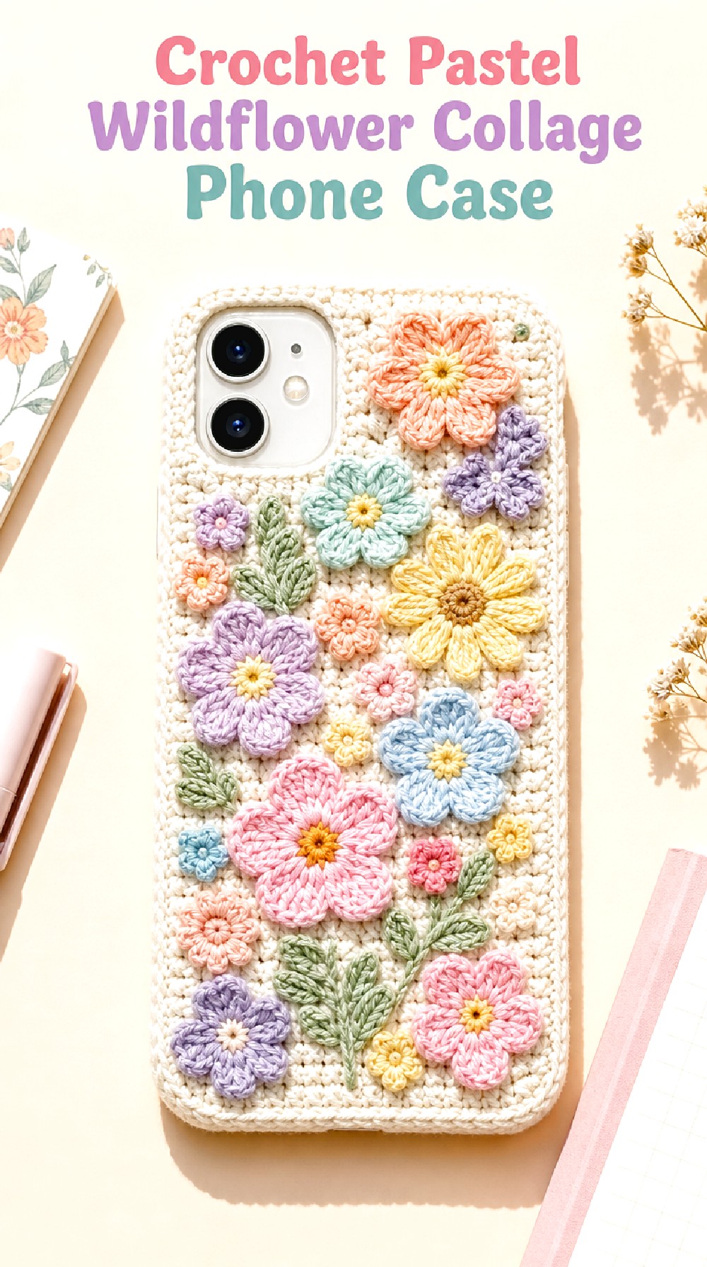
The Crochet Pastel Wildflower Collage Phone Case is the most colorful interpretation in the collection. Peach, mint, butter yellow, lilac, powder blue, and soft pink combine in a loose collage of miniature floral shapes. A cream base keeps the many shades connected, while playful placement gives the case the feeling of a treasured page filled with tiny pressed finds.
Color Without Clutter
Using several colors does not require covering every inch of the case. Leaving visible neutral space between clusters helps each pastel shade remain distinct.
Repeating one or two colors in several locations can also make a varied palette feel more cohesive.
A Playful Direction
Different blossom shapes can add to the collected look. Imagine a small daisy next to a tiny blue flower, followed by a simple petal cluster in peach or lavender.
The key visual idea is variety rather than perfect repetition.
Personalization Inspiration
This concept is especially easy to adapt around favorite colors. Someone who prefers cooler tones could focus on lilac, mint, and blue, while a warmer version might emphasize peach, yellow, and pink.
The background can also shift from cream to pale blush or soft sage for a noticeably different mood.
Crochet Minimal Single Stem Phone Case
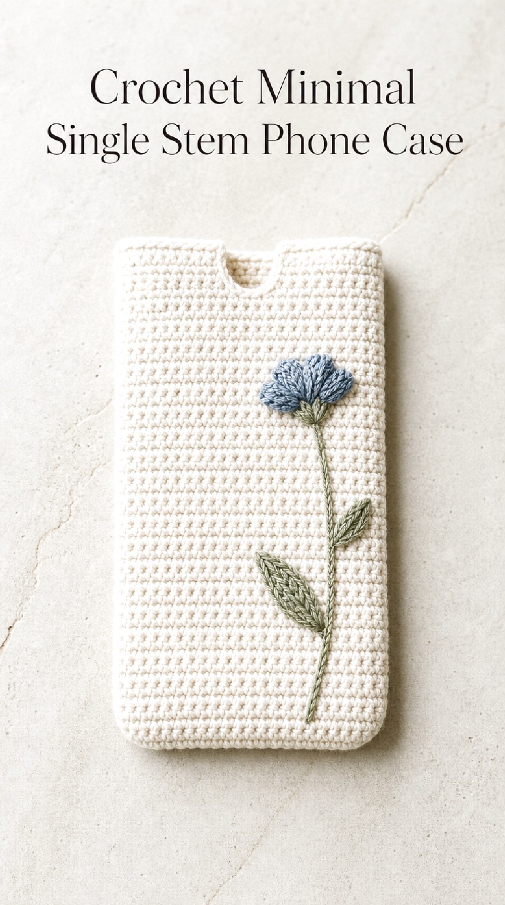
The Crochet Minimal Single Stem Phone Case reduces the entire botanical theme to one carefully placed floral element. A slender stem, one small blossom, and a pair of understated leaves can create a calm focal point against a mostly plain background. This is a particularly useful direction for anyone drawn to wildflowers but not to heavily decorated accessories.
Why Simplicity Works
With only one major botanical detail, every part of the composition becomes more noticeable. The flower color, stem direction, background texture, and surrounding empty space all play a larger visual role.
Placing the stem slightly off-center usually feels more organic than positioning it directly in the middle.
Minimal Color Direction
Warm white with dusty blue and sage feels quiet and airy. Cream with muted rust and olive offers a warmer alternative, while charcoal with one pale bloom creates stronger contrast.
Limiting the palette to two or three shades reinforces the restrained character.
The Detail That Changes It
The direction of the stem can completely change the mood. A straight vertical placement feels clean and botanical, while a gently angled stem feels softer and less formal.
A tiny bud or leaf near the flower can add interest without taking away from the minimal idea.
COMPARING THE LOOKS
| Direction | Floral Coverage | Overall Mood |
| Meadow Scatter | Medium | Relaxed and natural |
| Lavender Sprig | Light | Soft and romantic |
| Daisy Herbarium | Medium | Fresh and classic |
| Wildflower Border | Medium | Organized and decorative |
| Botanical Panel | Medium | Modern and structured |
| Pastel Collage | Fullest | Playful and colorful |
| Minimal Single Stem | Very light | Calm and understated |
| Moonlit Wildflower | Light to medium | Dark and dramatic |
If you are undecided, first choose between scattered, framed, centered, clustered, or minimal flower placement. That one decision can narrow the collection quickly.
COLOR AND STYLE INSPIRATION
A pressed-wildflower theme works especially well with slightly softened colors. Consider cream + dusty blue + sage for a quiet botanical look, oatmeal + rust + olive for autumn warmth, ivory + blush + moss for cottage romance, or charcoal + cream + plum for a darker direction.
For texture, balance decorative flower motifs with calmer background stitches. Raised centers, subtle edging, tiny leaves, and restrained dimensional details can add interest while still letting the overall case silhouette stay clean.
MAKE THE IDEA YOUR OWN
You can personalize these phone case concepts by changing just one or two visual elements rather than redesigning the entire look. Try shifting a floral arrangement from centered to corner-based, reducing a multi-color palette to two favorite shades, widening or simplifying the border, or replacing a cluster with one statement bloom.
The base color also has a major effect. Cream creates softness, oatmeal adds warmth, sage feels botanical, and charcoal makes pale flowers more graphic. You can also explore different edging moods, small tassel accents, delicate scalloped details, asymmetrical motifs, or a more streamlined finish.
USING THE INSPIRATION
Use these concepts to build a color palette, compare floral layouts, collect ideas for a botanical mood board, or decide whether you prefer tiny scattered motifs or one larger visual feature. You might save several concepts and borrow one detail from each—for example, the colors from the autumn case, the layout from the lavender case, and the restraint of the single-stem version.
They can also serve as references when thinking about future gifts, seasonal accessories, or ways to coordinate a phone case with bags, clothing, and other crochet pieces.
WHO THESE IDEAS ARE FOR
This collection may be especially useful for crochet lovers who enjoy botanical themes, cottage-inspired color, pressed-flower aesthetics, small accessories, and nature-focused details. It also offers plenty of quieter options for anyone who likes florals but prefers modern or minimal styling.
FAQ
What colors give a crochet phone case a pressed-wildflower feel?
Softened botanical shades usually support the mood well. Dusty blue, faded lavender, muted yellow, blush, rust, sage, moss, cream, and oatmeal all suggest flowers and leaves that have aged gently rather than appearing freshly picked.
Should the flowers cover the entire phone case?
Not necessarily. A single stem, corner cluster, narrow border, or centered botanical panel can communicate the theme with much less decoration. The amount of floral coverage depends mainly on whether you prefer a minimal, balanced, or statement look.
Which idea feels most modern?
The Crochet Botanical Panel Phone Case and Crochet Minimal Single Stem Phone Case have the cleanest visual structure. Both use significant negative space and focused motif placement, making the botanical details feel more graphic and restrained.
How can I make the look less cottage-inspired?
Choose a sharper palette and simpler placement. Charcoal, stone, cream, sage, and muted plum can feel more contemporary than pastel garden colors. A centered panel, narrow border, or isolated floral motif can also make the concept feel cleaner.
What is a good direction for a colorful case?
The Crochet Pastel Wildflower Collage Phone Case offers the most varied palette, while Crochet Meadow Scatter Phone Case provides color with more breathing room. Keeping a neutral background helps multiple flower shades feel coordinated.
How can I use these ideas without choosing one complete design?
Borrow individual visual details. You could save a favorite color combination from one concept, motif placement from another, and edging mood from a third. Treat the collection as a reference library for narrowing down the atmosphere you want.
CONCLUSION
Pressed-wildflower inspiration can take a crochet phone case in many directions, from tiny blue blossoms and romantic lavender sprigs to warm autumn florals and nearly minimalist single stems. Start by choosing the arrangement that catches your eye first, then compare palettes and decorative density. Even one small detail—a muted flower color, asymmetric cluster, botanical border, or contrasting base—can become the starting point for a phone case style that feels distinctly your own.